Beyond the Shelf: Why the Brands Winning Now Aren’t Selling Products
Signal

Beyond the Shelf: Why the Brands Winning Now Aren’t Selling Products

R.MayAugust 20265 min

The consumer shift isn’t from beauty to beverages. It’s from products to positions — and the brands that understand this are building empires.

The Category Is No Longer the Category

Walk into any Whole Foods, Erewhon, or boutique wellness store and you'll see the same thing: a wall of colour. Pastel cans in neat rows. Bottles with labels designed by typographers, not chemists. Gummies that look more like jewellery than supplements. The functional beverage and supplement market is projected to hit $228 billion by 2028, but the brands actually winning aren't competing on function. They're competing on feeling.

Poppi didn't become a household name because of apple cider vinegar. Ghia didn't win Esquire's Drink of the Year by listing botanical extracts. Olipop didn't raise $68 million by talking about prebiotic fibre. These brands understood something the rest of the wellness industry is still catching up to: people don't buy products. They buy identity. They buy aspiration. They buy the version of themselves they want to become.

Poppi: Gut Health as Lifestyle Statement

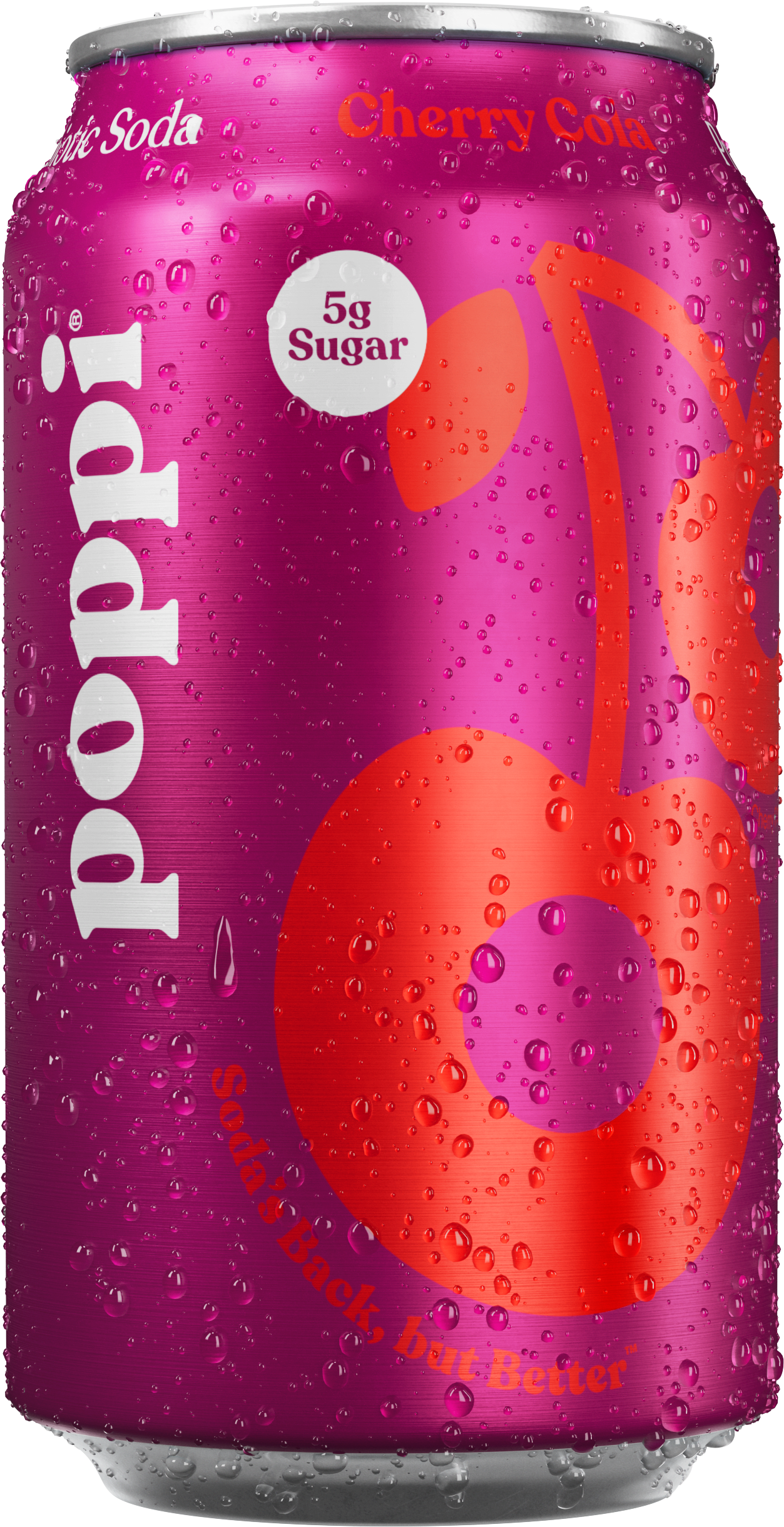
Allison Ellsworth didn't set out to make a soda. She set out to make a moment. Poppi's colourful cans aren't just packaging. They're props. They're designed to be held, photographed, and posted. Every can is a tiny billboard for a specific kind of life: bright, playful, unapologetically wellness-adjacent but never preachy about it.

Ghia Original Aperitif - the non-alcoholic aperitif that won Esquire Drink of the Year
Poppi Cream Soda - prebiotic soda redefining gut health as a lifestyle

The real genius of Poppi isn't the prebiotic. It's the positioning. They took the most unsexy health claim in the world (gut health, which literally no one wants to discuss at a dinner party) and turned it into something you'd want on your desk, in your fridge door, on your Instagram story. The "Be Gut Happy" tagline works because it reframes digestion as joy rather than medicine. That's not a product decision. That's a cultural one.

Poppi understood that the wellness consumer doesn't want to be told they have a problem. They want to be invited into a world where the solution already feels like a lifestyle. The can is the invitation.

Ghia: The Aperitif That Isn't Trying to Be Alcohol

Most non-alcoholic brands define themselves by what they're not. "Zero proof." "Alcohol-free." "Sober curious." It's the same negation-based positioning that keeps the entire category sounding like a support group rather than a choice. Ghia doesn't do any of that.

Melanie Masarin built Ghia to exist in its own category, not as a substitute for something else. The bottle, designed by Perron-Roettinger, looks like it belongs on a bar cart in Lake Como, not on a "wellness" shelf next to kombucha. The flavour profile (citrus, gentian, elderflower) doesn't mimic a negroni. It creates something that demands to be sipped slowly, over ice, with a slice of orange and nothing else. It's not pretending. It's presenting.

Ghia won Esquire's Drink of the Year, a title previously held exclusively by spirits. That's the distinction. Not best non-alcoholic drink. Best drink. Period. The brand doesn't apologise for what it lacks. It celebrates what it is.

Olipop: Nostalgia as a Design Language

If Poppi made gut health feel like a mood board and Ghia made the aperitif feel like a destination, Olipop made fibre feel like a time machine. The branding is unapologetically retro. Vintage cola. Classic root beer. Cream soda. The cans reference a pre-clean-ingredient era while the contents are anything but.

Ben Goodwin and David Lester built Olipop on a specific insight: the brands that dominate nostalgia don't sell the past. They sell the feeling of the past, which is comfort, which is safety, which is trust. When you hold an Olipop can, you're not thinking about chicory root inulin. You're thinking about the corner store you biked to when you were ten. That emotional bridge is where purchase decisions actually live.

Poppi Cherry Cola - colourful cans designed to be held, photographed, and posted
Ghia aperitif styled serving - botanical extracts, Mediterranean tradition, zero alcohol
Olipop Orange Cream - prebiotic fibre meets vintage soda nostalgia
Olipop Classic Grape - retro branding that sells the feeling of the past

Olipop's $68 million Series B wasn't raised on fibre content. It was raised on the understanding that wellness, at its best, doesn't feel like wellness. It feels like something you already loved, made better.

The Gummy Revolution: Arrae, Gruns, and the Aesthetic of Wellness

Arrae didn't design a supplement bottle. They designed a handbag accessory. The pastel capsules, the minimalist typography, the beige-on-beige palette. These are products that look like they belong in a Celine store, not a GNC. Bloat and Calm, their two hero SKUs, aren't named after conditions. They're named after feelings. No one wants to buy "anti-bloating formula." Everyone has felt bloated and wanted it to stop. The naming is the reframe.

Gruns took the same logic and went further. Gummies that look like candy, taste like candy, and sit on your counter like candy. The packaging is bright, the branding is irreverent, and the entire experience says: this isn't medicine. This is something you look forward to. The adult gummy market barely existed five years ago. Now it's a $6.2 billion category, and the brands winning it are the ones that understood that the format is the message.

The real lesson: the product inside is table stakes. The experience around it is the brand. When wellness brands look like pharmaceutical brands, they communicate that wellness is medical. When they look like lifestyle brands, they communicate that wellness is aspirational. The medium is still the message, and the medium here is design.

What This Means for What Comes Next

The brands profiled here share a specific DNA. They didn't enter existing categories. They reframed them. They understood that in a crowded market, the product that wins isn't the one with the best ingredients list (though that helps). It's the one that makes people feel something before they even open the package.

This is the Signals thesis: the future of consumer brands isn't in better formulations or louder claims. It's in better storytelling, sharper design, and a deeper understanding of the identity consumers are buying into. The shelf is where products go to compete on price and function. Beyond the shelf is where brands compete for meaning.

Poppi, Ghia, Olipop, Arrae, Gruns. They didn't just put wellness in a prettier bottle. They made the bottle itself the point. And that's the shift the rest of the market is still catching up to.

Arrae Calm - supplements designed like luxury beauty products, not medicine
Gruens adult gummies - wellness that looks like candy, not pharmaceuticals
Signals
R.May
Opinion, not algorithm.
Insight, not noise.